To use this Design Manager, you can go to VPCart
administration: Website > Layout Manager.
Then click the
icon below in the left panel:
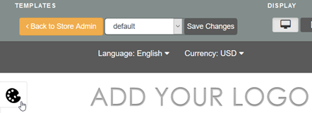
Once clicked, you should see two
tabs. We will explain each tab as below.
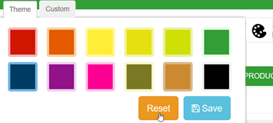
A. Theme
With
existing theme color, you can pick one of the existing 12 theme colors that suit
your liking.
If you click on a theme color, you will see the change
instantly on the Layout Manager page.
Click Save button to confirm
your color.
After a theme color applied, VPCart will change the color
display for the site globally.
Example below showing after a green theme
color is applied:
- Top header background color

- Top navigation menu background
color

-
Titles/Headings color on left/center/right columns


- Breadcrumbs text links
color
- Cart
title row background color


- Buttons color


- Product details page header tabs
color
- Footer
alphabets menu background

- Footer social media icons,
Paypal/credit card logos, menu links color, copyright text color

You can reset any selected
color to VPCart default color by clicking the Reset button as shown on below
screenshot:
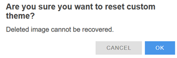
A
pop up will be displayed to confirm you want to reset. Simply click OK to
proceed with the reset.
B. Custom
With Custom
theme, you can define your custom colors that suit your liking for certain
sections.
Note: You can combine both the
Theme and Custom together for your VPCart site.
Custom
theme has the following sections:
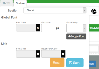
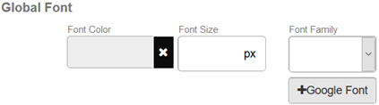
B1. Global
On this Custom
Global setting page, you can specify global font family, font size, font color,
link color, hover color and even you can add your own Google font into the
existing font list.
To specify global font
color,
font size, font family you can set from “Global Font”
as shown on screenshot below:
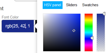
To pick your own font color,
click on the Font Color box, and you will be presented with a color
picker popup.
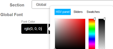
The popup will have HSV
panel, Sliders and also Swatches color picker. Simply choose
one that suit your liking to pick a color. This tool makes it easy to create,
adjust, and experiment with custom colors for the web.
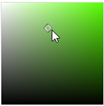
Choose a color
using the HSV panel
HSV is an alternative to RGB in which color is
represented in terms of hue, saturation, and value.
1) In the HSV panel
color picker, select the vertical slider to your favorite color.
This
slider represents the Hue which is the color portion of the color model (Red,
Yellow, Green, Cyan, Blue, Magenta)

2) Then adjust the saturation and
brightness by clicking in the color field, moving the circular
maker.
3)
Next, you can select the level of transparency/opacity for the global text
color.
Please click instead of slide to your wanted opacity.

4) Click Save
button to save your defined color.
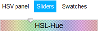
Choose a color using the
Sliders
The Sliders is using HSL model.
HSL is an alternative to
RGB in which color is represented in terms of hue, saturation, and lightness.
1) In the Sliders color picker, change the HSL-Hue slider to your
favorite color.
This first slider represents the Hue which is the color
portion of the color model (Red, Yellow, Green, Cyan, Blue, Magenta)
2) Adjust the HSL-Saturation
slider to your liking.

3) Adjust the HSL-Lightness slider to
your liking.

4)
Adjust the Opacity slider to your liking.

5) Click Save button to
save your defined color.
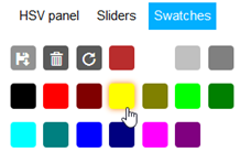
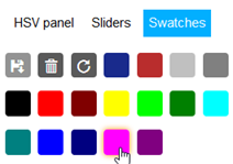
Choose a color using the Swatches
Swatches
are the default colors and also the colors that are saved for reuse throughout
the site. You can choose and apply them for the global font color.
Simply
select a color you want from the list of available colors and click Save
button.
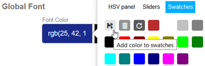
If you have previously selected a color from HSV panel or
Sliders, you can save the picked color into the list of colors in
Swatches.
In the example below, from HSV panel a color has been picked
and it is showing as rgb(25, 42, 140).
If we want to save this picked color
to be available in Swatches, then at the Swatches tab, click the disk
icon to save it as shown on below screenshot:
Your saved color will then available in the Swatches list
:
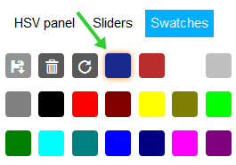
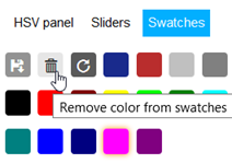
You can also
remove any unwanted color from the list by selecting the unwanted color, and
click the trash icon.
For example, we want to remove the pink
color from the available color list. We select the pink color first as shown in
below screenshot:
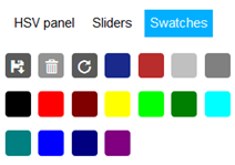
Then we click trash icon, and
pink color is removed.
The color list will no more showing
the pink color:
You can also reset Swatches to
show only default colors, by clicking the reset button as showing on below
screenshot:
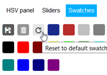
If you click that, it will popup
confirmation to reset:
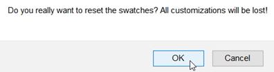
Click OK to reset all colors to
default.
Enter Font Size
You can specify your own font
size for the global font by just entering the number in the “Font Size” text
box.
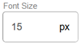
Click Save
button to save your change.
Choose Font Family
By default, there are three font family you can
select:
- Open Sans.
Preview of the font as below:
- Source Sans Pro
Preview
of the font as below:
- Roboto Condensed
Preview of the
font as below:
Please click Save button after a font
family is selected.
Add Google Fonts
You can also add more
Google fonts into the Font Family dropdown list.
To add Google fonts,
below are the steps:
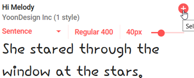
a. Go to https://fonts.google.com/
b. Search
a font you want. For example, “Hi Melody” font. Click the + icon.
c. You will see there is a
bottom bar showing “1 Family selected”. Please on it to expand.

d. You will see the form as
below:
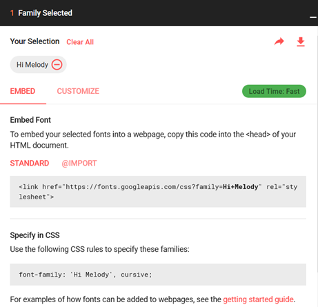
Please
keep this form open, as we will copy the some of the values here
later.
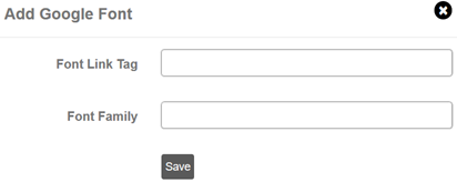
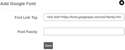
e. Now go back to your Design Manager and click the
+Google Font button.
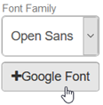
f. You will see popup form as
below:
g.
Go back to the Google font page (step d). Locate the Standard box and
copy the value eg:
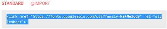
h. Paste it into the “Font Link Tag”
field.
i. Go
back to the Google font page. Locate the Specify in CSS box and copy the
value eg:
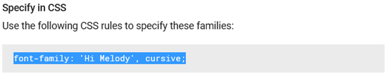
j.
Paste it into the “Font Family” field.
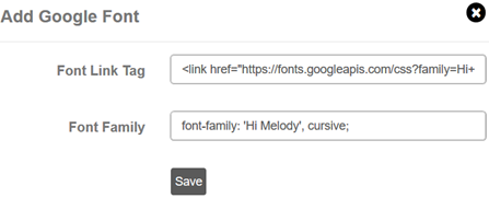
k. Click Save
button.
l. Refresh your Design Manager to see the change and the
new font “Hi Melody” is added.
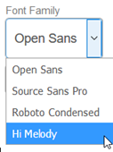
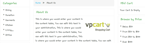
You can now select the new Google
font as your global font. Below is the preview after we selected the “Hi Melody”
as the global font.
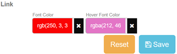
Global Link Font Color and Hover Font Color
To use your unique link font color and hover font color, you
can select your own colors as shown on screenshot below:
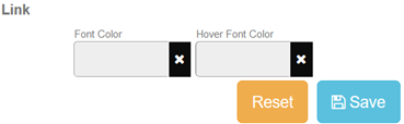
To select the color you can use
either HSV panel, Sliders or Swatches color picker as explained
above.
Example, we set Link font color as red and hover font color as
pink:
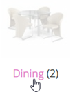
Below is the preview of links in
front store:
|
Normal link
color |
On mouse over link color |
|
|
|
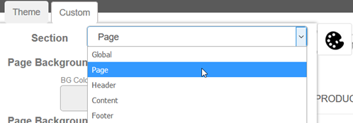
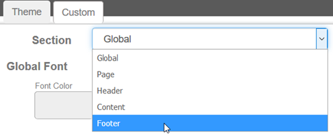
B2. Page
To access the Page setting in
Design Manager, click the Design Manager icon, then click the Custom tab and
select “Page” from the “Section” dropdowns.
The Page consider to be the
section outside of website contents, after the website header and before the
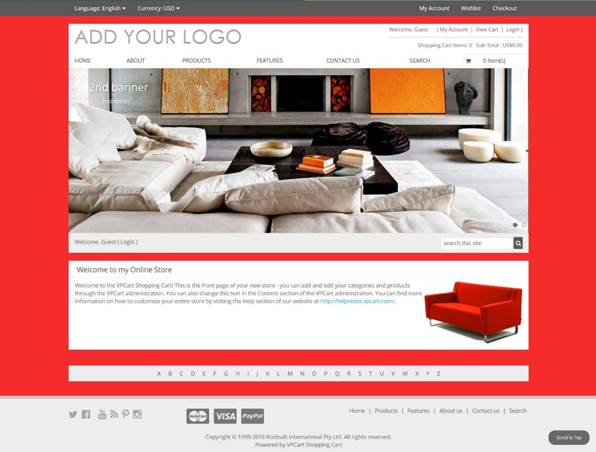
footer. We can also call this the background section.
The screen shot
below showing example of the red color background which is under the Page
control area:
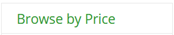
On this Page setting, you can specify the following:
-
Your own Page background color.
- Your own Page background image.
- Your
own Page background width.
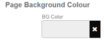
B.2.1 Page Background Color
To
specify your own background color, you can set from “Page Background Colour” as
shown on screenshot below:
To pick your own background
color, click on the BG Color box, and you will be presented with a color
picker popup. The popup will have HSV panel, Sliders and also
Swatches color picker.
Note: We have explained on chapter
B1. Global before on how to use the three color
pickers.
Simply choose one that suit your liking to pick a color then
click Save button.
To reset background color to default, please
click the X button and then click Save button.
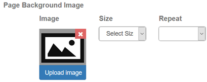
B.2.2
Page Background Image
To specify your own background image, you can
set from “Page Background Image” as
shown on screenshot below:
To upload your own page
background image, click the “Upload image” button and you will see
another popup as shown below:
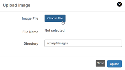
Click Choose File button
to browse to your own background image file then click Upload button.
Remember to click Save button after background image
uploaded.
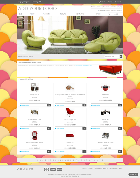
Example the below background image will be used for Page
background:

And here is the preview of VPCart
site after uploaded the above background image:
To specify background image size,
you can set from “Size” as shown on screenshot
below:
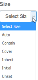
These are the background-size CSS
property that specifies the size of the element's background image.
Below
are the explanation for each Size options:
|
Auto |
Scales the background image in the corresponding
direction such that its intrinsic proportions are
maintained. |
|
Contain |
Scales the background image as large as possible
without cropping or stretching the image, to make sure the background
image is fully visible |
|
Cover |
Scales the background image as large as possible
without stretching the image. If the proportions of the image differ from
the element, it is cropped either vertically or horizontally so that no
empty space remains. |
|
Inherit |
Scales the background image the same as its parent
element. |
|
Initial |
Scales the background image to its initial
value. |
|
Unset |
Scales the background image as either inherit or
initial, depending on whether the property is inherited or
not. |
You can also refer to the below URL for more
information about CSS background-size property:
https://www.w3schools.com/cssref/css3_pr_background-size.asp
To specify background image repeat property, you can set from
“Repeat” as shown on screenshot
below:
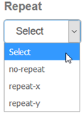
These are the background-repeat
CSS property. The background-repeat property sets if/how a background image will
be repeated.
Below are the explanation for each Repeat options:
|
no-repeat |
The background-image is not repeated. It will only be
shown once |
|
repeat-x |
The background image is repeated only
horizontally |
|
repeat-y |
The background image is repeated only
vertically |
You can also refer to the below URL for more
information about CSS background-repeat property:
https://www.w3schools.com/cssref/pr_background-repeat.asp
B.2.3 BG Sections
To specify background width,
you can set from “BG Background Width” as shown
on screenshot below:
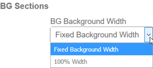
Below are the explanation for
each Width options:
|
Fixed Background Width |
Set the background width to be a fixed
size |
|
100% Width |
Set the background width to be
100% |
Please make sure to click Save button every
time you pick a width option.
B3. Header
To access the
Header setting in Design Manager, click the Design Manager icon, then click the
Custom tab and select “Header” from the “Section” dropdowns.
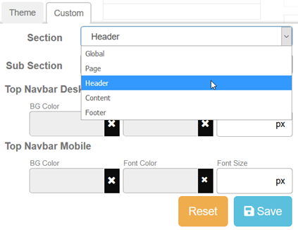
This Header section
allows you to add your own styles for the background color, font color, font
size, and font family for related site header sections.
The screen shot
below showing example of sections which are under the Header control
area:
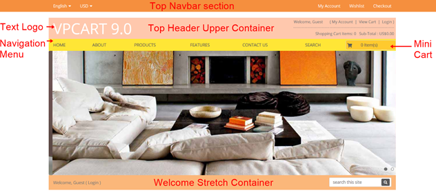
On this Header setting, you can specify the following (please
refer to above screenshot for each section location in front store):
-
Your own style Header section “Top Navbar” for desktop and mobile with
your custom background color, font color and font size.
- Your own style
Header section “Top Header Upper Container” for desktop and mobile with
your custom background color, font color and font size.
- Your own style
Header section “Logo” text with your custom font color, font size and
font family.
- Your own style Header section “Navigation Menu”
(including Navigation dropdowns and Mini Cart) with your custom
background color, font color and font size.
- Your own style Header section
“Welcome Stretch Container” with your custom background color, font color
and font size.
To select which Sub Section you want to apply your
own style, simply locate the second dropdown after the first Header
dropdowns.
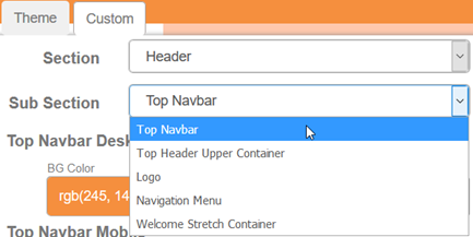
Then
pick your own background color, font color, font size, and font
family.
Please make sure to click Save button after every changes
you made.
B4. Content
To access the Content setting in
Design Manager, click the Design Manager icon, then click the Custom tab and
select “Content” from the “Section” dropdowns.
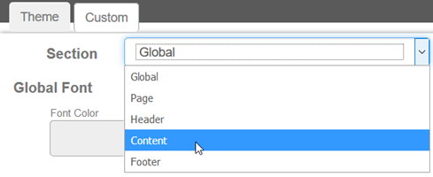
This Content section allows you
to add your own styles for the background color, font color, font size, and font
family for related site content sections.
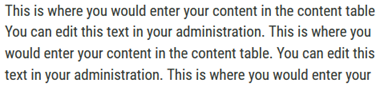
On this Content setting, you can specify the following:
-
Your own style for Content Global Widget.
- Your own style for Content
BreadCrumb.
- Your own style for Content Cart Table.
- Your own style for
Content Buttons.
- Your own style for Content Forms.
To select which
Sub Section you want to apply your own style, simply locate the second
dropdown after the first Content dropdowns.
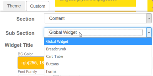
B.4.1 Content Global
Widget
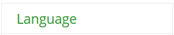
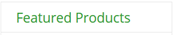
Global Widget allows you setup the following:
- Widget Title background color, font color, font size, font
family and bold or italic style.
- Widget Container background color, font
color, font size, font family and bold or italic style.
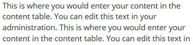
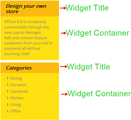
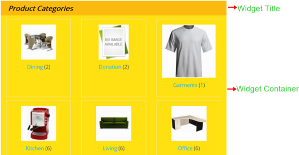
Example of Widget
Title and Widget Container we set from Design Manager end:
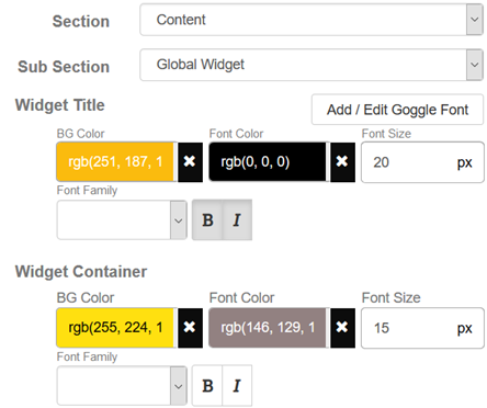
To pick your own color, click on the
color box, and you will be presented with a color picker popup. The popup will
have HSV panel, Sliders and also Swatches color picker.
Note: We have explained on chapter B1. Global before on
how to use the three color pickers.
Simply choose one that suit your
liking to pick a color then click Save button.
To reset color to
default, please click the X button and then click Save
button.
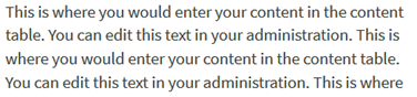
And here is the preview of the result in front store
widgets:
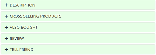
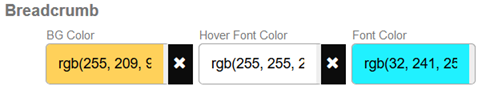
B.4.2 Content
Breadcrumb
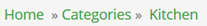
Content Breadcrumb allows you setup the following:
- Content breadcrumb background color, hover font color and
font color.
- Checkout steps icon font color and active font
color.
Example of Content breadcrumb we set from Design Manager
end:
To pick
your own color, click on the color box, and you will be presented with a color
picker popup. The popup will have HSV panel, Sliders and also
Swatches color picker.
Note: We have explained on chapter
B1. Global before on how to use the three color
pickers.
Simply choose one that suit your liking to pick a color then
click Save button.
To reset color to default, please click the
X button and then click Save button.
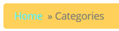
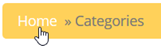
And here is the
preview of the result in front store:
|
Normal
breadcrumb preview |
On mouse over
breadcrumb preview |
|
|
|
Example of Checkout steps icon we set from Design Manager
end:
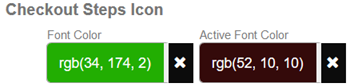
And here is
the preview of the result in front store during checkout:

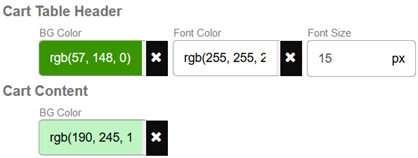
B.4.3 Cart Table
Content Cart Table allows you setup the following:
- Cart Table Header background color, font color and font
size.
- Cart Content background color.
Example of Cart Table we set
from Design Manager end:
To pick your own color, click on the
color box, and you will be presented with a color picker popup. The popup will
have HSV panel, Sliders and also Swatches color picker.
Note: We have explained on chapter B1. Global before on
how to use the three color pickers.
Simply choose one that suit your
liking to pick a color then click Save button.
To reset color to
default, please click the X button and then click Save
button.
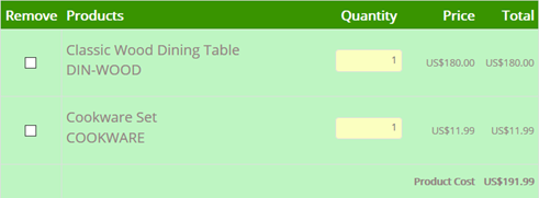
And here is the preview of the result in front store cart
page:
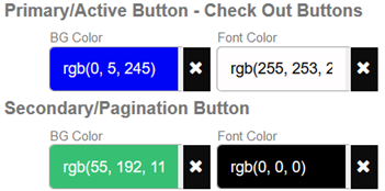
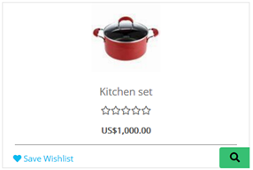
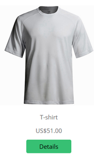
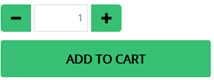
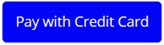
B.4.4 Buttons
Content Buttons allows you setup
the following:
- Primary/Active Button - Check Out Button background color
and font color.
- Secondary/Pagination Button background color and font
color.
Example of Primary and Secondary buttons we set from Design
Manager end:
To
pick your own color, click on the color box, and you will be presented with a
color picker popup. The popup will have HSV panel, Sliders and
also Swatches color picker.
Note: We have explained on chapter
B1. Global before on how to use the three color
pickers.
Simply choose one that suit your liking to pick a color then
click Save button.
To reset color to default, please click the
X button and then click Save button.
And here is the
preview of the buttons result in some of front store pages:


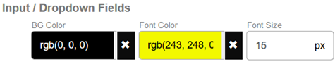
B.4.5 Forms
Content Forms allows you setup Input / Dropdown Fields background
color, font color and font size.
Example of Content Forms we set from
Design Manager end:
To pick your own color, click on the
color box, and you will be presented with a color picker popup. The popup will
have HSV panel, Sliders and also Swatches color picker.
Note: We have explained on chapter B1. Global before on
how to use the three color pickers.
Simply choose one that suit your
liking to pick a color then click Save button.
To reset color to
default, please click the X button and then click Save
button.
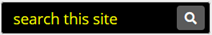
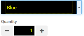
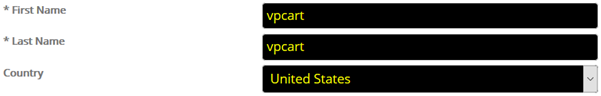
And here is the preview of the result in some of front store
pages:
B5. Footer
To access the Footer setting in Design Manager, click the
Design Manager icon, then click the Custom tab and select “Footer” from the
“Section” dropdowns.
This Footer section allows you to
add your own styles for the background color, font color, font size for related
site footer sections.
On this Footer setting, you can specify the following:
-
Your own style for ABC Container.
- Your own style for Footer Global.
-
Your own style for Footer Link Color.
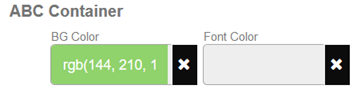
B.5.1 ABC
Container
With this ABC Container setting, you can set your favorite
background color and font color for the A B C D E F … links at the footer
section.
Example of ABC Container we set from Design Manager
end:
To pick
your own color, click on the color box, and you will be presented with a color
picker popup. The popup will have HSV panel, Sliders and also
Swatches color picker.
Note: We have explained on chapter
B1. Global before on how to use the three color
pickers.
Simply choose one that suit your liking to pick a color then
click Save button.
To reset color to default, please click the
X button and then click Save button.
And here is the
preview of the ABC Container result in front store:

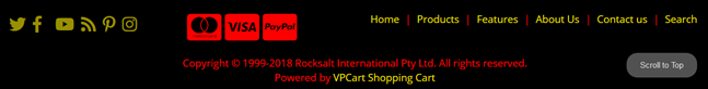
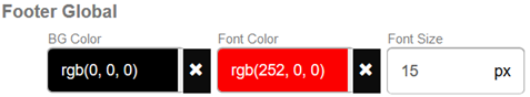
B.5.2 Footer Global
With this Footer Global
setting, you can set your favorite background color, font color and font size
for the entire footer section after the ABC container.
Example of Footer
Global we set from Design Manager end:
To pick your own color, click on the
color box, and you will be presented with a color picker popup. The popup will
have HSV panel, Sliders and also Swatches color picker.
Note: We have explained on chapter B1. Global before on
how to use the three color pickers.
Simply choose one that suit your
liking to pick a color then click Save button.
To reset color to
default, please click the X button and then click Save
button.
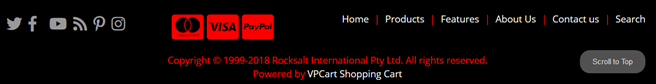
And here is the preview of the Footer Global result in front
store:
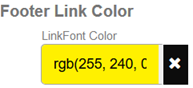
B.5.3
Footer Link Color
With this Footer Link Color setting, you can set
your favorite link color for the entire footer section after the ABC
container.
Example of Footer Link Color we set from Design Manager
end:
To pick
your own color, click on the color box, and you will be presented with a color
picker popup. The popup will have HSV panel, Sliders and also
Swatches color picker.
Note: We have explained on chapter
B1. Global before on how to use the three color
pickers.
Simply choose one that suit your liking to pick a color then
click Save button.
To reset color to default, please click the
X button and then click Save button.
And here is the
preview of the Footer Link Color result in front store: